Brand Identity
Brand Guidelines
Packaging
Print Design


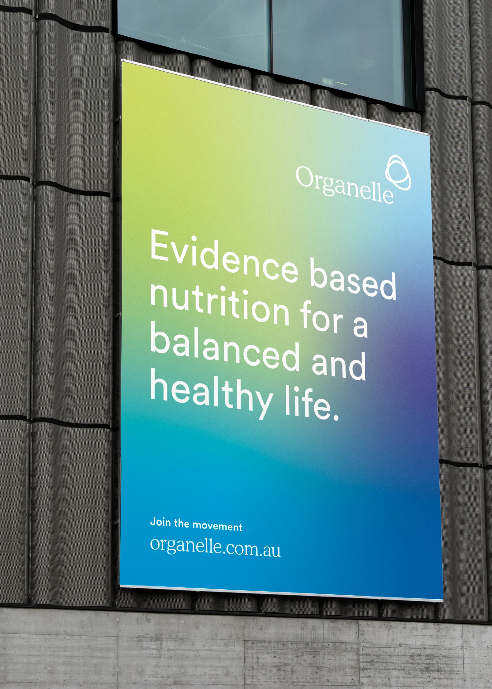
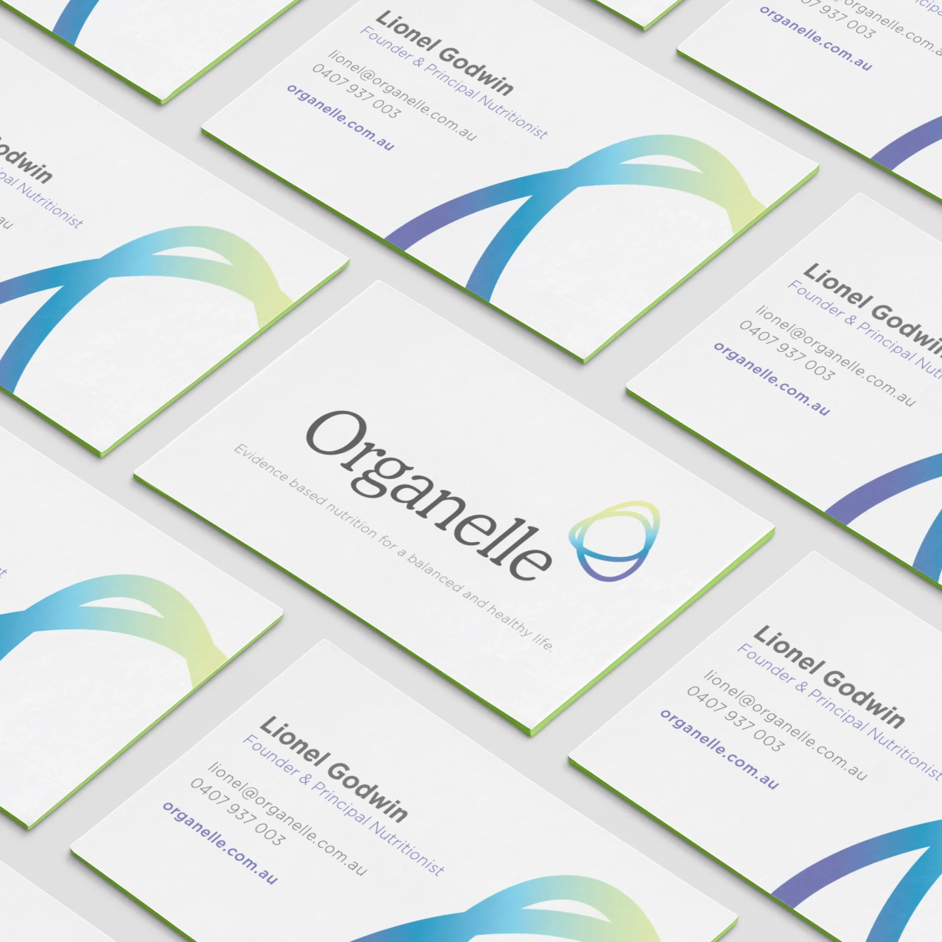
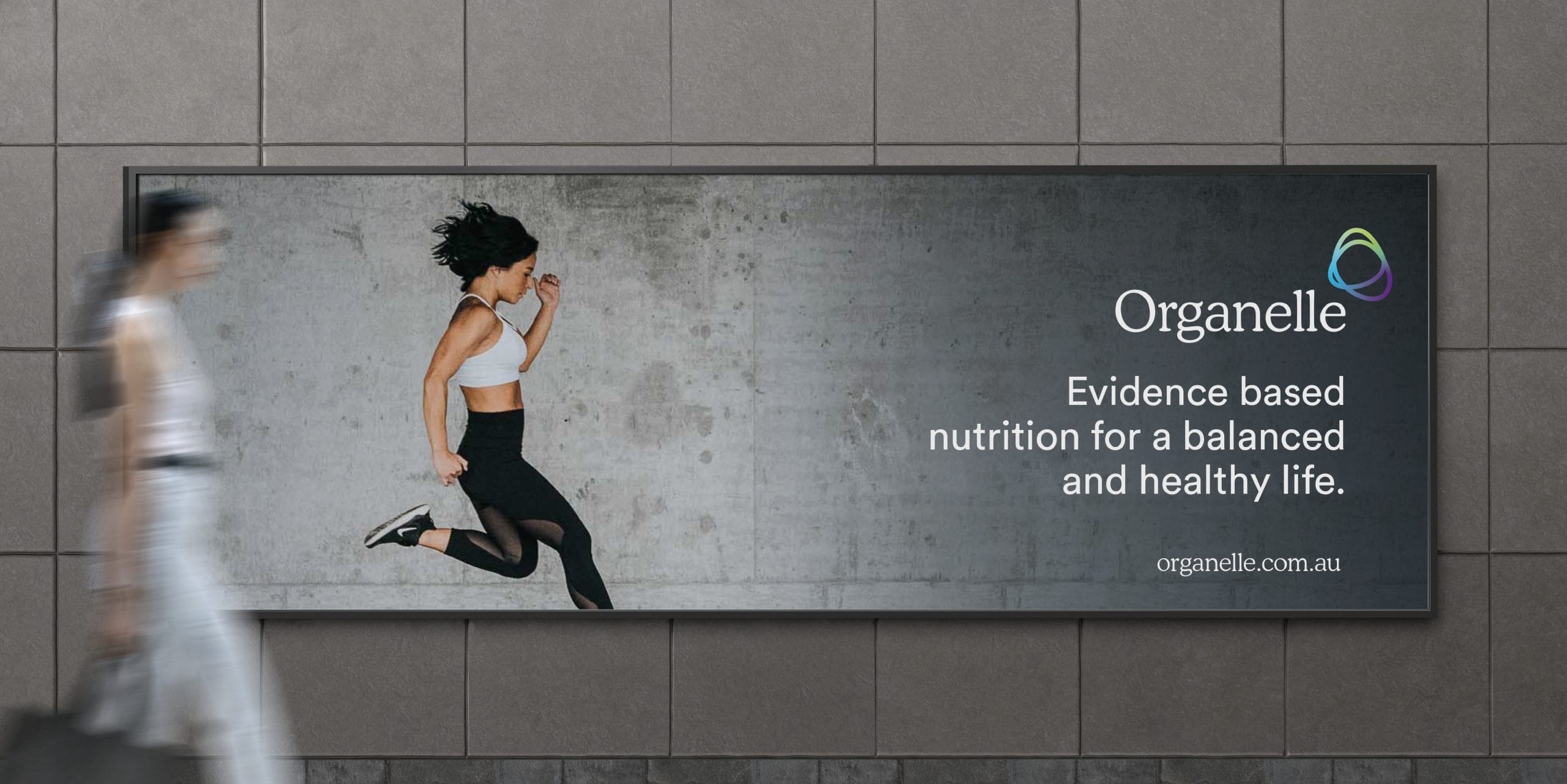


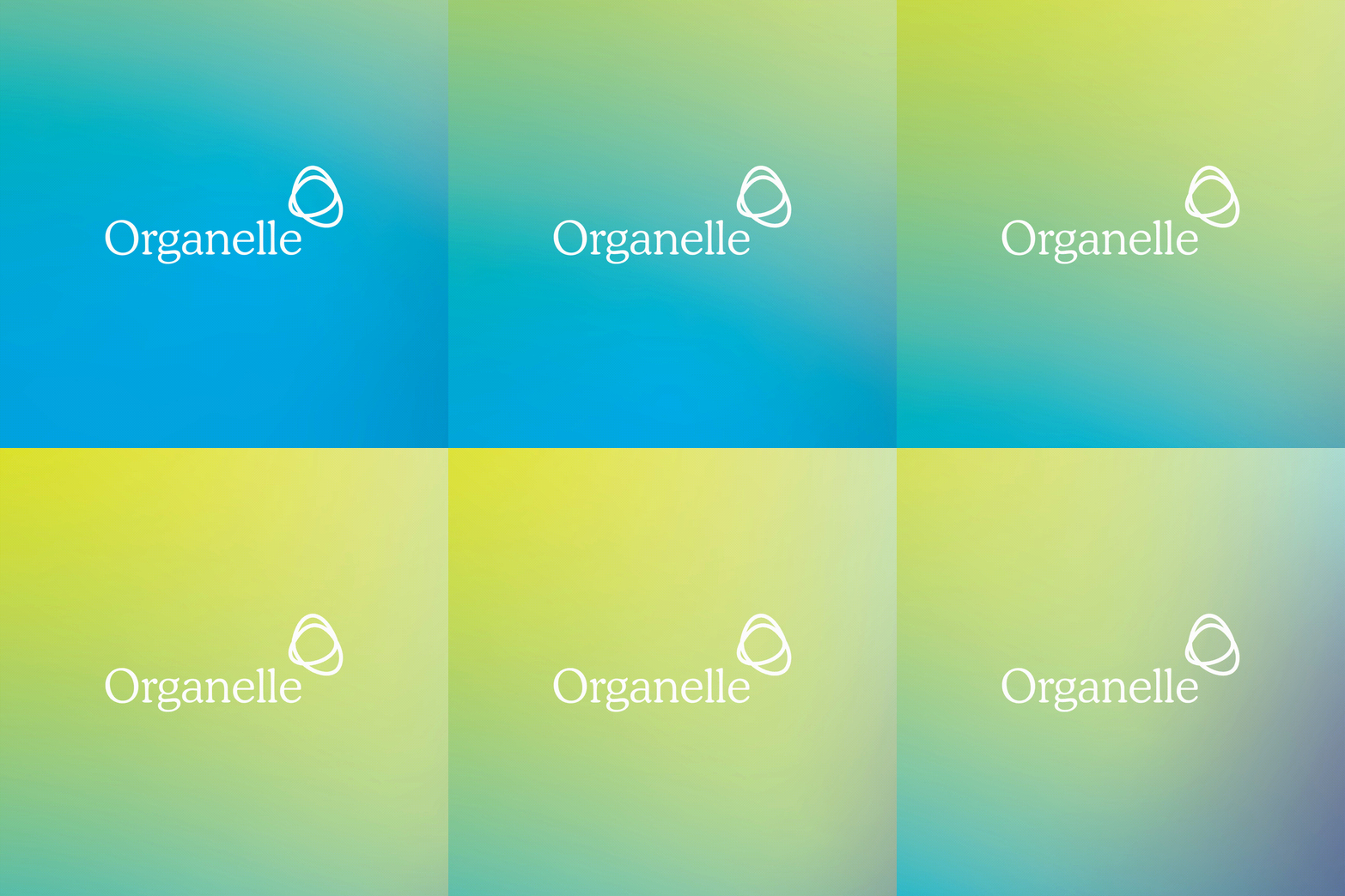
Our approach to this health-focused brand was rooted in the concept of activity and motion. We designed a visual identity that promotes a vibrant and healthy lifestyle. The brand's icon, incorporating motion and fluid shapes, is dynamically adaptable through unlimited gradient variations, ensuring a consistently fresh assets. Complementing this, we selected approachable fonts and a revitalized colour palette, all strategically implemented to achieve the brand's core objectives. This thoughtful combination of elements allows the brand to effectively communicate its message of wellness and vitality to its audience.
